
Monday, April 30, 2012
Pop Art
Saw an interesting entry about polipop & paintings, an exhibit about politics intersecting with pop art. What comes to mind is the popular Obama portrait:
 Pop art is an interesting medium in which politics can be expressed and commented on. Propaganda art is also a genre that has garnered popular interest. Very cool commentary on how art effects and interacts with popular culture and current events.

http://www.bmoreart.com/2012/04/photos-from-bma-print-fair.html
Saw this about print art and thought it was interesting. While searching for graphic design and print art, I came across "Print" magazine. There was a "print in motion winner" seen here:
http://imprint.printmag.com/film2/print-in-motion-winner-medusa-in-fragments/
I thought it was very interesting use of type and motion.
Saw this about print art and thought it was interesting. While searching for graphic design and print art, I came across "Print" magazine. There was a "print in motion winner" seen here:
http://imprint.printmag.com/film2/print-in-motion-winner-medusa-in-fragments/
I thought it was very interesting use of type and motion.
Friday, April 27, 2012
Film & Title Design
Wednesday, April 25, 2012
Layers
Tuesday, April 24, 2012
Cool Commercial
I really like this video promoting Nature Valley's promote the parks project. I think the tree shadows transforming into the upc is very clever and I love the clean look - it goes well with Nature Valley's advertising presence.
Monday, April 23, 2012


The Need for Design
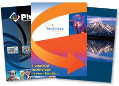
I was thinking today what the world would be like without design. All of the fonts would be the same, signs and ads would be bland and to-the-point. The world would be black and white. Anyway, it was something I was thinking about as I was driving to class, looking at the different signs and bumperstickers on the backs of cars. Design creates the world around us in a way. A visual means of communication, which is so vital and necessary to people. Just some thoughts.
Friday, April 20, 2012
Are Internet Memes Art?
An interesting video about what constitutes art.
here
I would say any expression of self is art, whether it be written or visual. As for internet memes, I would say that it isn't art because it's not expressing an aspect of the creator. However, I see the video's point, it is made to evoke certain feelings. I still have trouble calling memes art, however.
here
I would say any expression of self is art, whether it be written or visual. As for internet memes, I would say that it isn't art because it's not expressing an aspect of the creator. However, I see the video's point, it is made to evoke certain feelings. I still have trouble calling memes art, however.
Thursday, April 19, 2012
Portraits
http://www.flickr.com/photos/patrickjoust/6255769612/in/set-72157611470203647#/
I really love Patrick Joust's street photography. I think portraits are about catching an honest moment, and he does that really well. I think in design, that honesty is important, too, so the reader can relate to your brand and feel welcomed by it.
I really love Patrick Joust's street photography. I think portraits are about catching an honest moment, and he does that really well. I think in design, that honesty is important, too, so the reader can relate to your brand and feel welcomed by it.
Wednesday, April 18, 2012
Animation
http://www.youtube.com/watch?v=OI3shBXlqsw&feature=player_embedded
Very cool animation. Would like to learn how to do this.
Very cool animation. Would like to learn how to do this.
Quirky and Squishy
http://www.bmoreart.com/
The Zig-Zag exhibition in Baltimore focuses on the act of drawing as a political statement. Meredith Pingree's works are described as "quirky and squishy," while other artists also look and examine form and construction. It's interesting because it's a form of design I haven't yet worked with, since I haven't done 3D yet. It's an art form I'd like to explore, mostly because of how abstract the works can be to warrant such adjectives as quirky and squishy.
The Zig-Zag exhibition in Baltimore focuses on the act of drawing as a political statement. Meredith Pingree's works are described as "quirky and squishy," while other artists also look and examine form and construction. It's interesting because it's a form of design I haven't yet worked with, since I haven't done 3D yet. It's an art form I'd like to explore, mostly because of how abstract the works can be to warrant such adjectives as quirky and squishy.
Sunday, April 15, 2012
Tongue in Cheek
Here are a few funny ads that use clever images to show they have a sense of humor while selling the product effectively


Love This

Similar

Bad Girls
Thinking more about the Yoko Ono/John Lennon photo and the use of gender in model positioning. Of course, a lot of people have talked about the absurd (at times) positions female models are photographed in. Then I thought of the recent movie/TV promoting an edgier, more realistic side of women, like in Bridesmaids and the show Girls. Here's promotional photos of these:


Considering, again, playing with gender in my ad/s.

Considering, again, playing with gender in my ad/s.
An Interesting Photography Series
Found this in Time mag online:
 A series focused on those with mental and physical disabilities. Very beautiful images. Done by Denis Darzacq. Link here: http://lightbox.time.com/2012/04/13/act/#14

Play on words
Illustration/Photo
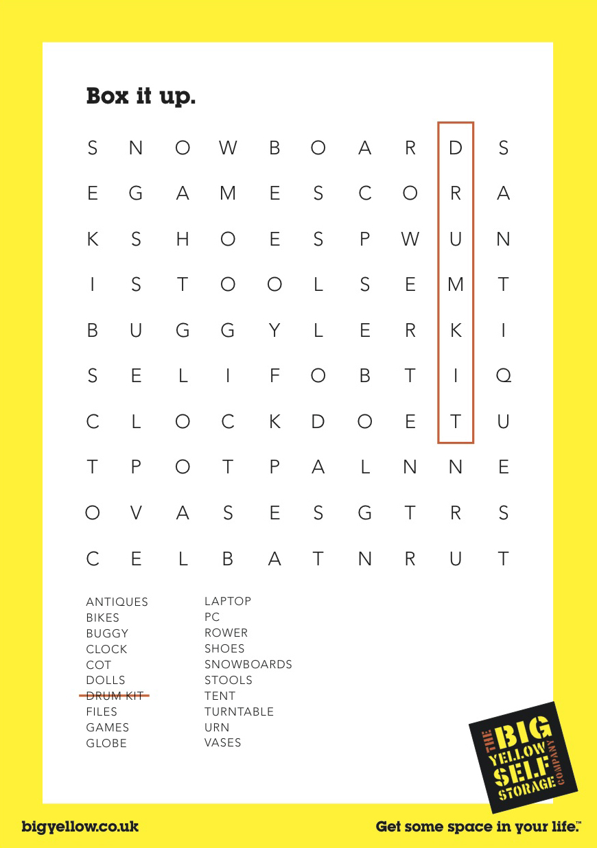
I also like the use of illustration with a photographic backdrop
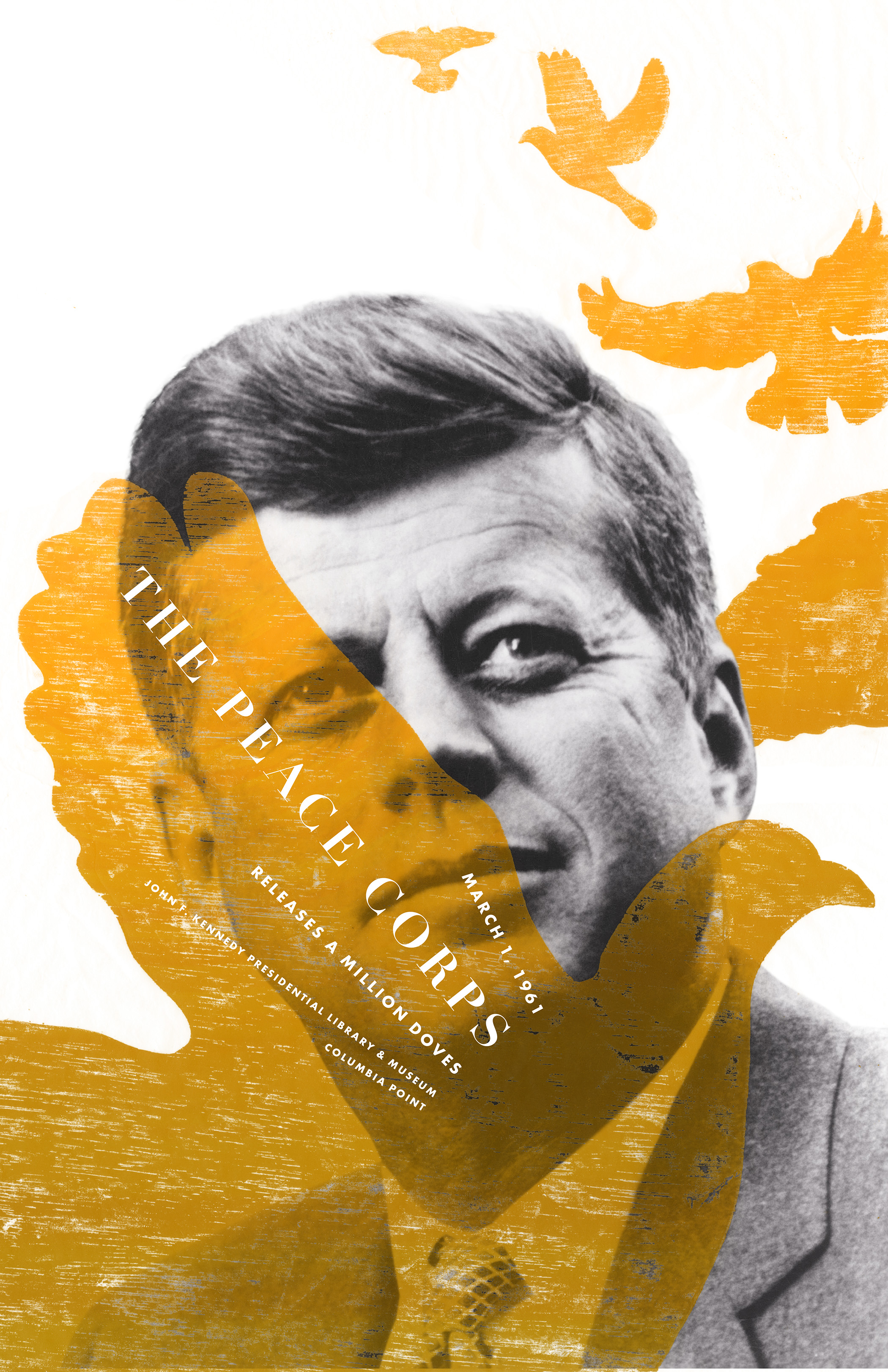
 Not many colors are used, but the overlap and the texture looks very cool, as well as the placement of the text.
Texture

Separation
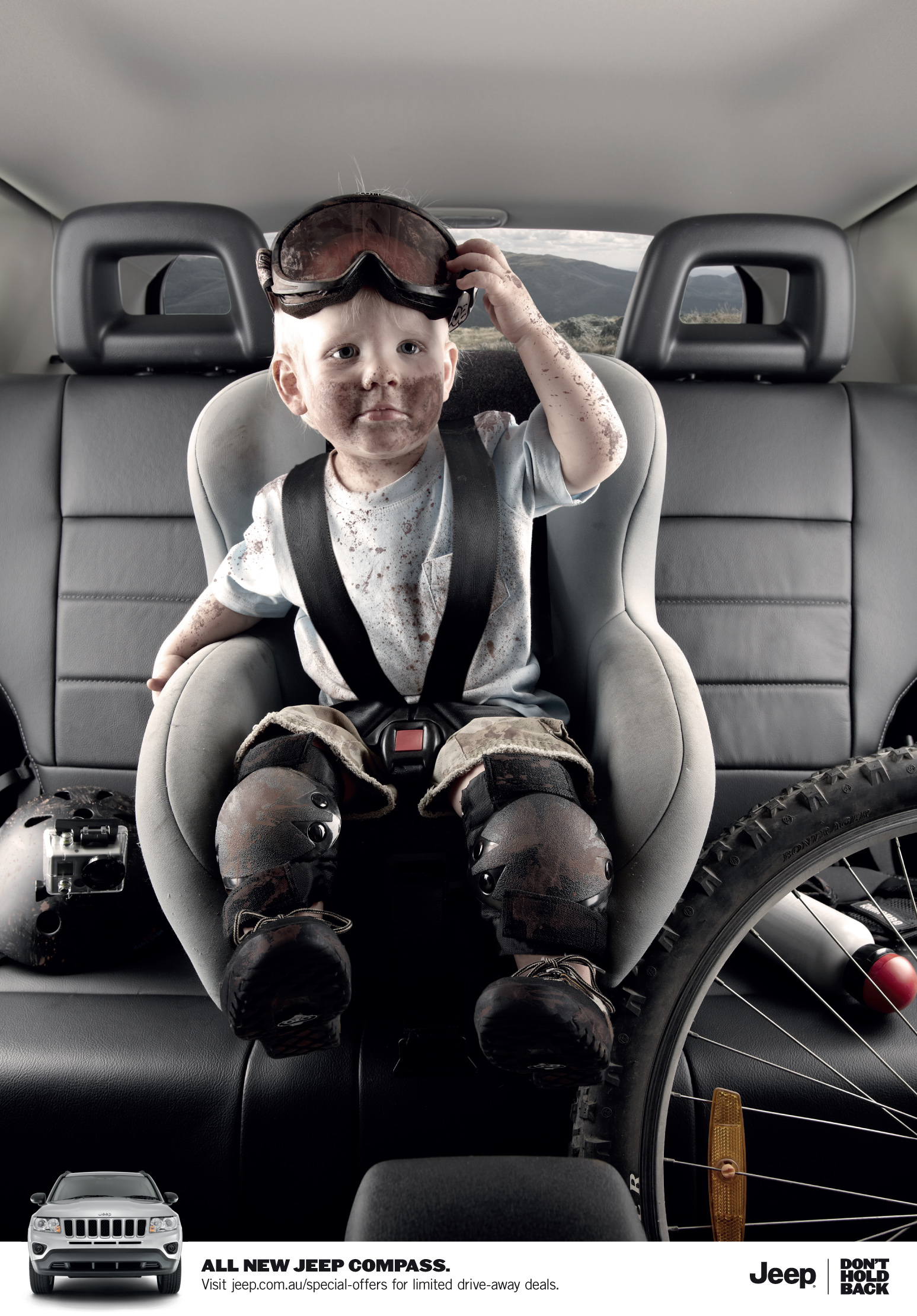
Here's an ad that isn't entirely an image, but an image with a strip of white for text on the bottom
 I like the separation of the text because it draws the eye to the logo and the product of the advertisement. Considering this for my Time ad because of its clean look.
Subscribe to:
Posts (Atom)